Research and PlaNNING
62 Posts
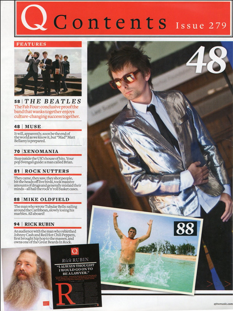 Noticeable Points - many pictures (4)
- Mag Title at top banner and issue number - 5 mini stories and a main story -Band name with info below - page numbers on the pictures
0 Comments
SimilaritiesAgain, there is a common theme of red here as it stands out clearly to the reader and draws their attention in as it has connotations of danger or alertness which will make the reader subconsciously aware of what the writing says. Because of this, it contrasts highly with the black writing which then makes the normal coloured writing on the rest of the page. there are always two or more photos on the contents page, often either of the band on the front cover or the band that some of the articles are about. The list of pages also tends to go down vertically on one side of the page or the other in a neat and organised fashion. there is also usually a bigger bit next to the contents list with a little bit about the double page spread or about the magazine in general. DifferencesOverall, there really aren't many differences at all which in itself stands out. This would suggest to me that the general layout of a contents page is neat and well structured, clear and easy to read. This means that I will have to do the same sort of layout for my contents page. The one difference i have spotted in these different Indie music magazine contents pages (I know that one of them has hip hop elements but there is some rock and Indie in there too) is that the pictures are often ordered a little differently. For example, in the first Q magazine, there is one big picture of a band and then a neat, smaller picture underneath whereas in the other Q magazine, it is rather messy whilst still holding some sort of order and clarity. The pictures are canted or off centre with the page numbers of the corresponding articles on the pictures. Codes and Conventions of an Indie Magazine Contents PageFrom this evidence, i can conclude that the codes and conventions for a general Indie music magazine are:
. Red and black colour scheme . A neat list of pages . more than one picture . A bigger section with more information I will use this information whilst constructing my own Indie magazine. SimilaritiesIn all of the magazines, the bands on the cover are very serious, not smiling and are generally looking straight into the camera with their band-mates looking elsewhere in some of them. All but one of them uses the colour red so this is obviously a common trait between Indie magazines as well as either a light or dark background, one extreme or the other. All of them also have the band name of the band in the picture in large font on the front so this again is a trait between the magazines in my genre. The masthead is always in the top left hand corner but sometimes the name of the magazine stretches all the way across the page. Rolling stone magazine is like this and that is the layout that the people who took my survey recognised the most so i will probably do my masthead like this in my magazine. Another likeness is that all but one magazine had other, smaller coverlines on the front page, usually in quite a neat fashion. DifferencesEach of the magazine covers have a slightly different layout, even if they're the same magazine. This probably gives the magazine and each band on the front cover their own uniqueness on the cover. the shot types of the pictures vary a bit. in some of them the picture is a mid-shot where you can see the waist, hips and maybe even part of the legs, some have a close up of the band member's faces whereas some have a mid close up where it's chest up. In my magazine I will ask my Facebook friends and twitter followers to do another survey so that i can get some audience feedback on what shot type they think that i should use. A couple of the pictures on the front cover of the magazines are in greyscale or black and white which makes the coverlines and the title of the magazine stand out much more than on the ones where the picture has colour in it. Codes and Conventions of an Indie Magazine CoverFrom this analysis, i have learnt that the common things on Indie music magazine front colour are:
- The colour red - neutral staring expressions - Masthead in the top left or stretching across - more than one coverline - a main coverline with a band name - either a light or dark background
This is my Double page spread analysis for a couple of music magazines on slideshare.
I have annotated these double page spreads of magazines
I ended up with a total of 19 votes as I discounted the ones that were being silly. Number oneNumber one got no votes from the people that I know on Facebook. I think that this is because the grey and white colours clash and the pure fact that the other one is just better in general. Number TwoNumber two only got one vote also. I think that this is again because the colours clashed a little bit and didn't have the connotations of rock that it needed to have for my Indie magazine that I want to create. Number ThreeNumber three got 4 votes which means that it is the second most popular masthead design in the picture. I think that this is because it gives the autumn colours of the leaves which I would personally relate to the sound and background of Indie music. I think that this one wasn't as popular as the last one because the writing is thinner than the writing in the bottom one and therefore harder to notice. Number FourThe fourth one was the most popular with 14 votes. I think that the is because in this one there is a combination of the thicker writing and the autumn colours. On further inspection into the thoughts of my friends, family and acquaintances my grandma told me that she personally thought that I should combine the writing of three and four and keep the autumn colours In conclusion, I'm going to make my final masthead in the design of number 4 but have more aspects of number three within it.
This presentation shows all of the results from my survey on Survey Monkey and analyses them as well as interviews and analysis of the interviews with people from the main age bracket of people that are interested in the genre of music that I want to, complete with the questions all tied up in one place with a little red satin bow.
Why not take a look? (IF YOU NEED TO MUTE THE MUSIC, THERE IS A SYMBOL ON THE BOTTOM LEFT HAND SIDE OF THE PRESENTATION FOR YOU TO CLICK ON. PRESS ESC TO GET OUT OF FULL SCREEN)
Please go and take a look at my power point of my contents page of two different magazines analysis on Slideshare:
This task is basically about me experimenting with text fonts and designs to use for my final music magazine. I used Photoshop in order to create it and made many different forms of the writing. when I first opened Photoshop, I selected the text tool and switched to the typography part of the sidebar. with this, I adjusted the text to how iI liked it and then I experimented with the paintbrush tool, selecting different patterns and trying them out. In the end, I decided that I liked the leaf pattern best. I think that this went with the indie theme I was trying to create. The writing looked sophisticated and not wild and the leaves symbolised the streets that they grew up in the urban life. I think that this link works well!  I think that I prefer the bottom one as the colours of the leaves are like autumn colours and the style of the writing is sophisticated yet somewhat rebellious and 'grey' which replicates the genre in my opinion. I will put this out to the people on my social media pages also and then decide how to make my final masthead for m music magazine.
In this task, I had to analyse the front covers of two different genres of music magazines. I picked out all of the different things on the page and then I said why they were there an why they were styled in the way that they were. this meant that I developed my analysis skills and means that I understand how all of the different elements of a front page of a magazine come together to create a certain effect on the people looking at it and makes them want to buy the magazine whilst also showing the genre of music the magazine is about clearly. Here it is: |


